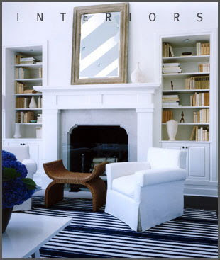
Hagan began designing interiors in 1985, founded Victoria Hagan Interiors in 1991 and established Victoria Hagan Home, a line of furniture, fabrics and accessories, in 2002.
Her design philosophy is “keep it simple”, “keep it comfortable”, “keep it interesting” but most important “keep it fun”. She keeps interiors very clean with a neutral palette and isn’t drawn to any period or style but rather goes for versitility in a room. Her interiors look very relaxed and stylish at the same time.
Love the pop of red, dark wood with the clean crisp white. You get a taste of old with the new. Victoria's interiors are both masculine and feminine.
Designed by Victoria Hagan
Victoria’s style reminds me so much of Darryl Carter’s style, below, I love both. They both use a mix of the traditional and modern, the old and the new with clean lines.
Designed by Darryl Carter, pictures via Elle Decor
Designed by Darryl Carter, Washington DC Row House, photo Simon Upton
Darryl Carter used masculine looking leather-covered doors as a headboard, above. While Victoria designed a feminine leather screen, below, for her home collection here.
The Carroll leather screen by Victoria Hagan
Victoria's furniture collection it's so stylish and clean and fits beautifully in today's interiors.
The James footstool designed by Victoria Hagan
The Wainscott chair from her home collection


.png)


11 comments:
Really love her style. Very crisp, elegant, functional and fun!
I will be checking her website to get ideas for my home! Thanks for sharing.
xo
Very elegant style, although here all that white would make me a little nervous!
Sharon
Would you believe Victoria has twin 7-year-old boys in all that white? Yikes!
I haven't heard of her, but I love her clean yet beautiful interiors.
Victoria is one of my favorite designers! I really love her work! Very chique! Nice post! Thank you for that!
Have a nice weekend!
xx
Greet
Just back from vacation and trying to catch up. I love Victoria's work. Her style is just beautiful. So refreshing after seeing all the trendy designs everywhere. Have a great weekend. Mona
I adore Victoria's work! Her rooms are always so fresh and sophisticated-thrilled to have found your blog!
Victoria's work is indeed timeless and classic with a contemporary edge. Great feature!
I liked the doors used as head boards used vertically instead of horizontally in Carter's designs. I agree VH is pretty and clean--well balanced. Come over and visit!
Best,
Liz
yes! I would have guessed DC for sure when I saw that VH room in black and white!
It's my first time visiting your site. Fantastic posting.
All the best,
David John
YHBHS
Interiors: Art Los Angeles
Post a Comment